Tuesday, 28 September 2010

Newspaper Front Page


This is my final 'Newspaper Front Cover' piece, which was created in InDesign.

What I had to do was create an article from one of my 'Animal Faces' pictures, and then from that construct a newspaper front cover - adding contents from other newspapers to make it appear more realistic.

I did this by firstly opening a blank A3 document and then onto the blank A3 document I used the ‘Rectangle Frame’ tool and ‘Guild Lines’ option for laying out and positioning each part of the front page how I wanted it. Then the fist thing I placed was the ‘Sun’ masthead by using the ‘Place…’ option and then selected the picture I got from Google, and then I used the ‘Free Transform’ tool to adjust it to the size I wanted and moved it to where I wanted it – I also right-clicked the masthead and selected ‘Display Performance’ and then ‘High Quality’ to make the image more in focus. Once I added a masthead I added a dateline, which I got off a ‘Sun’ newspaper off Google, and again I used the ‘Place…’ option but then the ‘Crop’ tool so only the dateline was visible, then I moved it under the masthead and used the ‘Free Transform’ tool to make it the size I wanted it – also I adjusted the quality by using the same method as before. After that I uploaded the picture I wanted to use as the main article by again using the ‘Place…’ option, selecting the picture from ‘My Documents’, and using the ‘Free Transform’ tool to adjust the size and then just placed it where I wanted it – and again changed the quality to ‘High Quality’ the same way as previous. Then I added my headline by using the ‘Type’ tool to add a text box, where I typed in my headline, and then I decided to adjust the text font (and changed it to Arial), adjust the text size (by clicking on the ‘Font Size’ option and making the ‘pt’ higher), and adjusting the height (by elongating the text by clicking on the ‘Vertical Scale’ option and putting the percentage higher) and the length (by spreading the letters by clicking on the ‘Horizontal Scale’ option and putting the percentage higher). Once I added the headline I added the article that goes with it, which I done using the same process that I used for the headline (bar the ‘vertical’ and ‘Horizontal’ tools, and also I changed some of the text from ‘Regular’ to ‘Bold’ by using the drop-down option). However, as there was a lot of text, some of it over-flowed; I fixed this by creating two more text boxes and clicking on the 'Hidden Text' icon (which is the little red box with a cross inside placed at the bottom right-hand size of the previous text box which had overflowed) and then clicking on the first empty text box, and then the same thing for the second text box – until there was no more over-flowing text. Furthermore, I added who it was reported by (me) and changed the text from ‘Regular’ to ‘Italic’. After that I added some advertisements in – to give the newspaper front cover a more realising look and to fill up the blank spaces – which I done by getting some off other ‘Sun’ newspapers off Google and doing the same process as the dateline (look above for details). And finally, once I was satisfied with my outcome, I saved it as an INDD file and also as a JPEG file.

After a lot of tinkering, i was pleased with my final outcome. I was pleased with was how the article looked, it looked professional and laid out in the style of a real article, also i was pleased with the general layout, it looked more or less like an actual Newspaper front cover in the set up of each part. The one thing in particular i was conscious of was the Masthead of the article, I'm not sure it it stands out as well as it could from the picture.

The only real technical difficulties i had were with the piece were the Masthead of the article; it blended into the picture a little too much for my liking, but unfortunately i did not know how to solve this predicament - something i will need to look into for future reference.

Research on Newspaper Layouts


These are six newspaper layouts I looked into as research for my own Newspaper Font Cover; The Sun, The Guardian, News of the World, The daily Telegraph, The Daily Mail and The Times.  After looking at these I have decided to go with a look like The Sun because it's more appealing and stands out more than the rest, plus it's more of a popular newspaper so my article will be more known about.

Tuesday, 21 September 2010

Buster Keaton Leaflet


This is my final 'Buster Keaton Leaflet' piece, which was created in InDesign.

What I had to do was create a leaflet from the layouts (pictures, text, etc) provided; I had to edit and input the picture and the text into the same way as the finished product layout (produced by the teacher) by following the steps provided.

I did this by opening up InDesign and then creating a new document (and making the document A4 size, and changing the 'Bleed' to 0.3mm). Once I done that I added 'Guides' to my new document, this was done by going onto the 'Create Guides' option and adding two columns (and then changed the name of the layer to 'Guides'). Then I needed to create a new layer which I done by clicking on the 'New Layer' tab in the layers box, and I names this new layer 'Picture'. After creating a new layer I placed a picture onto the layer, I done this by clicking on the 'Place...' option and then selecting the Buster Keaton picture, however the quality of the picture was poor so in order to improve it to a better quality I had to click onto the 'Display Performance' option and then selecting the 'High Quality Display' option. then I locked the 'Picture' layer and also created a new layer and named it 'Image Frame', on this layer what I did was I used the 'Pen' tool to draw around Buster Keaton, and once I had drawn all around him I then made the 'Picture' layer non-visible so you could just see the outline of Buster Keaton. Once that was done I had to place the same picture as before and then match the outline and the picture up. After that I adjusted the stroke by using the 'Stroke' option to bring up the Stroke Palette, this is where I changed the 'Align Stroke' option to 'Outside' and changed the 'Type' option to Thin-Thick and the 'Weight' option to 4pt - I also adjusted the colour of the line by going onto the 'Colour' option, where I changed the colour to Grey. Then I adjusted the size of the image, I done this by selecting the picture and using the 'Free Transform' tool to make (in my case) the image smaller until it was the size I wanted, and moved it to the bottom left-hand size of the page. Once that was done, I had to create a new later called 'Text', and to that new layer I added the text for the leaflet using the same 'Place...' option as I used with the picture. Then, as the text was overlapping the picture and the other have of the page, I had to use the 'Text wrap' option, and on the text palette I chose the 'Wrap around the shape' frame and changed the 'Off-set' to 0p6 - and for the final text wrap changed it to 0.5cm. Also I moved the picture off the page slightly because I noticed some text was turning into 'islands' and made it more difficult to read. After that I made a copy of the Buster Keaton picture, then deleted the picture inside the fame leaving just the outline (which I adjusted in size a little), after which I removed the outline by going onto the 'Stroke' palette and changing the weight to 0 and then going onto the 'Text Wrap' palette and changing the off-set to 0.3cm. One I had done that I then placed the overflow of text from the previous column into the outline, which I done by clicking on the 'Hidden Text' icon (the little red box with a cross inside placed at the bottom right-hand size of the previous text box which had overflowed) and then clicking on the Buster Keaton outline. Finally I adjusted the text size and font, and then once satisfied I saved it as a INDD file and also as a JPEG file.

For this picture, I was satisfied with my final results. What I thought I done especially well with was cutting around Buster Keaton, as I followed his outline carefully resulting in no dodgy angles and parts of him missing. However, what I had technical difficulties with was the text; I wanted it so that Buster Keaton's 'vision' was the only part in the outlined section, so it took a lot of adjusting with text size and positioning to achieve that. I also struggled with not making some of the texts into 'islands'; it involved a lot of movement and size adjusting and I'm still not completely satisfied with my outcome but I got it done as best as I could.


Tuesday, 14 September 2010

Animal Faces


These are my final 'Animal Faces' pictures, which were edited in Photoshop.

What I had to do was chose a picture of an animal and a picture of a person (celebrity) and combine the two faces together to morph them into one - so, in this case, the animals have human features.


First picture

For this picture I chose a polar bear and Katy Perry, and from Katy Perry I chose to use her eyes on the polar bear. My reason for choosing her eyes was because it made the polar bear look feminine and, although you can tell it is an edited picture as polar bears obviously do not have eyes like a humans, it looked more 'natural' and not just placed onto the picture.

I done this by opening up Photoshop and then creating a blank A4 page, then I chose the pictures I wanted to use off Google (and made sure they were high quality) and then uploaded them onto Photoshop. Then I copied the picture of the polar bear onto the blank A4 page, where it came out small, this is where I had to use the 'Free Transform' option to adjust it to the size of the blank A4 page - without distorting the picture. Once that was done I went back to the picture of Katy Perry and decided I wanted to use her eyes, so I used the 'Lasso' tool to cut around her eyes and then dragged and dropped them onto the picture of the polar bear. Then, once both of Katy Perry's eyes were on the polar bear I used the 'Free Transform' option to adjust her eyes to the size I wanted them to be, and in the place I wanted them to be. After that I used the 'Eraser' tool (and adjusted the size, hardness and opacity) to erase around the areas of skin around her eyes. Once the skin had all been erased around her eyes I adjusted the colour of her eyes to make them blend and look more natural, I done that by going onto the 'Colour Balance' option and changing the levels of each colour. Finally, I used the 'Blur' tool around the edges of her eyes to make them sit on the polar bears face more easily, and after that I saved the final picture as a Photoshop Document and also as a JPEG file (in 'Optimized Quality' for website use).

For this picture, I was happy with my results as it had the 'natural' look I was after and worked well with giving the polar bear a feminine quality - whereas before I felt that the polar bear looked more masculine.

Technical difficulties I had with this picture was that I struggled with making Katy Perry's eyes look natural on the polar bears face, but I fixed this by using the 'Colour Balance' option, also I struggled with making both her eyes the same size, but I fixed this by - instead of just using the 'Lasso' tool to cut out her eyes individually - I cut out both eyes together, and by doing this - when using the 'Free Transform' option - both of her eyes would change size together. Furthermore, I attempted to use Katy Perry's lips on the polar bear; however they did not sit on the polar bears face naturally - no matter what tool I would use on Photoshop - so I did not use her lips as I felt it destroyed the picture.


Second Picture

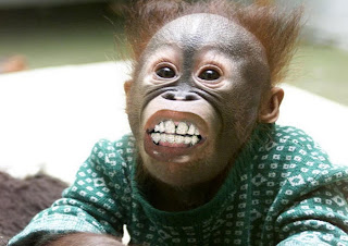
For this picture I chose a monkey and Lil' Wayne, and from Lil' Wayne I chose to use his month on the monkey. My reason for choosing his mouth was because his mouth blends with the monkey’s features with ease and had, again, a 'natural' look towards it - considering the fact that monkeys do not actually have mouths like a humans, let alone diamond 'Grills'.

I done this in the same way as I done the previous picture, all of the steps are the same; however the body part of the human is different.

For this picture, I was satisfied with my results as Lil' Wayne's mouth sat on the monkeys face with ease and worked well with the positioning and general image of the monkey, however I felt that his mouth looked slightly misplaced - but after asking peoples opinions to whether it looks in place, I decided to leave it how it was.

Technical difficulties I had with this picture was making Lil' Wayne's mouth position well with the stance of the monkeys face - as his mouths positioning was opposite to the positioning of the monkeys face - but I fixed this by using the 'Flip Horizontal' option so then his mouth was facing the same direction as the monkeys face. Furthermore, I struggled with making Lil' Wayne's mouth the right size, but I managed to fix that as best as I could with the 'Free Transform' option.